Au delà du simple inverse : pourquoi le dark mode change tout
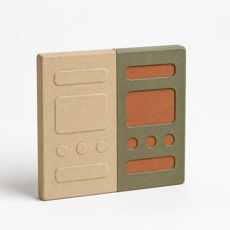
Dark mode UX UI is no longer a visual gimmick for power users. When a user activates light mode or dark mode, they expect the same level of clarity, the same hierarchy of elements, and the same feeling of control. Designing dark and light together means treating each theme as a first class experience, not a background afterthought.
Most teams still start from a light background and then flip everything to a dark background with white text, assuming contrast will magically work. In practice, this naive theme design breaks colour semantics, destroys depth, and often increases eye strain instead of offering reduced eye fatigue. A robust dark interface strategy requires rethinking surfaces, elevation, and color roles so that both light and dark variants feel coherent and accessible.
Think about how your interface communicates state through colour and colours, not just through a single hex value. A primary button on a light surface cannot simply become the same hue on a black background or very dark background, because perceived contrast changes with surrounding elements. Users unconsciously expect dark surfaces to feel softer, with gray ramps and subtle gradients that preserve accessibility for people with visual impairments.
On OLED screens, a well executed dark theme can help reduce energy consumption and extend battery life. Public talks from Google’s Android team have indicated that a mostly black background with carefully tuned gray surfaces can reduce battery drain by up to around half at medium brightness, although exact figures vary by device, content, and measurement method. When you design dark layouts with this in mind, you align UX decisions with eco design best practices and give users a concrete benefit beyond aesthetics.
There is also a psychological dimension to dark interfaces that many teams underestimate. Research from Nielsen Norman Group on dark mode usability shows that people often expect dark environments for focused tasks, creative tools, or late night reading, while they prefer light environments for browsing, shopping, or quick checks. A mature dual theme strategy acknowledges these patterns and lets users choose their preferred mode without sacrificing readability, contrast, or interaction clarity.
Surfaces, profondeur et contraste : reconstruire la grammaire visuelle en sombre
When you move from a light background to a dark background, the entire perception of depth flips. In light mode, elevation is usually expressed by darker shadows under lighter cards, while in dark mode UX UI, elevated elements often become slightly lighter than the base surface. This inversion means that designing dark layouts requires a new mental model for how elements float, stack, and separate.
Instead of jumping directly to a pure black background and pure white text, start by defining a scale of gray surfaces. Many design systems now use a near black base, such as #121212, because it reduces halos around white text and improves perceived contrast for users with mild visual impairments. This subtle shift in color values is one of the most effective best practices to reduce eye strain while keeping the interface visually rich.
Semantic colour tokens are your best ally here. Rather than hard coding a specific color for each component, define roles such as surface-primary, surface-secondary, text-primary, text-muted, border-subtle, and state colours for success or error. In light mode, surface-primary might be a light gray background, while in dark mode it becomes a dark gray that still separates clearly from the even darker base.
Contrast ratios must be checked separately in both modes, because a color that passes on a white background can fail on a dark background. Aim for at least 4.5:1 for normal body text and 3:1 for large headings, and consider 7:1 for small or dense text. Tools like Stark, Contrast or the built in accessibility inspectors in Figma and Sketch help you validate that text on coloured elements reaches the required level of contrast. Pay special attention to small text, thin icons, and subtle borders, which often disappear in dark mode when designers rely too heavily on low contrast grays.
Finally, remember that light to dark transitions are not only about static screens. Motion, shadows, and blur behave differently when the base is dark, and dark layers can feel heavier if every elevation uses the same shadow recipe. Studying how platforms like Material Design or Apple’s Human Interface Guidelines handle layered dark backgrounds will help you refine your own theme language and keep both modes visually consistent.
Couleurs sémantiques et design tokens : un système pour deux modes
A sustainable dark mode UX UI strategy starts with a token based system rather than a gallery of one off colours. Instead of assigning a fixed color to each component, you define semantic roles that can adapt to both light mode and dark mode without breaking meaning. This approach lets you support dark environments and light environments with a single coherent design language.
Begin by mapping your core roles across background, text, and interactive elements. For example, you might define background-base, background-raised, and background-overlay, then text-primary, text-secondary, and text-inverse, plus accent colour tokens for actions and feedback. In light mode, background-base could be almost white, while in dark mode it becomes a deep gray that still allows white text or light gray text to reach the right contrast level.
State colours need special care because they carry strong semantics for users. Error, warning, and success colours that work on a light surface may vibrate or blur on a dark background, especially on OLED screens. Test each state color in both modes, and adjust saturation and brightness so that users with visual impairments can still distinguish states at a glance.
Design tokens also help you manage subtle dark mode details designers often forget, such as borders, dividers, and focus rings. A border-subtle token can map to a light gray in light mode and to a slightly lighter gray in dark mode, preserving hierarchy without resorting to harsh white lines. Focus indicators should remain visible on both black background and dark gray surfaces, which sometimes means using a bright accent colour rather than a simple outline.
To operationalize this system, many teams now combine Figma variables with custom workflows powered by AI assisted plugins, as shown in this analysis of advanced Figma custom skills for UI design. By centralizing tokens, you can update a single semantic color and propagate changes across hundreds of screens in both modes. This reduces the risk of inconsistent combinations and keeps your theme design aligned with evolving accessibility standards.
Accessibilité, fatigue visuelle et attentes réelles des utilisateurs
Dark mode UX UI is often sold as a universal solution for reduced eye fatigue, but the reality is more nuanced. For some users, especially in low light environments, a dark background with well tuned gray surfaces and soft white text can reduce eye strain significantly. For others, particularly people with certain visual impairments, light mode with a high contrast light surface remains more comfortable.
Accessibility starts with measurable contrast, not with aesthetic preference. Aim for at least WCAG AA contrast ratios for all text, and consider AAA for small fonts or critical elements. This means checking every combination of text and background colour in both light and dark variants, including secondary labels, disabled states, and subtle UI elements that often slip through reviews.
Be cautious with pure white text on a pure black background, because this pairing can create halos and flicker effects on some displays. Many best practices recommend slightly off white text on a near black background, which softens the transition between pixels and reduces eye strain during long reading sessions. This is especially important for content heavy products like news apps, documentation tools, or messaging platforms.
Accessibility also covers interaction states and motion. Focus outlines, hover states, and pressed states must remain visible in both modes, even when users enable high contrast settings or system level accessibility options. When you support dark preferences at the system level, make sure your reduced animations and transitions do not rely solely on subtle shadows that disappear on dark surfaces.
Finally, listen to real users rather than assuming that everyone will expect dark interfaces by default. Offer a clear toggle between light mode and dark mode, plus an option to follow the system setting, and explain briefly how each mode can help in different contexts. When you treat accessibility, user comfort, and energy efficiency as first class constraints, you move beyond cosmetic dark themes and build trust with demanding users.
Impact énergétique et éco conception : le dark mode comme levier concret
On OLED and AMOLED screens, dark mode UX UI has a measurable impact on energy consumption. Pixels on a black background or very dark background are literally turned off, which means the device uses less power to display the same content. For products with heavy daily usage, this effect on battery drain becomes a tangible benefit that users can feel.
Studies from Google on Android apps have shown that interfaces with predominantly dark backgrounds can significantly reduce battery usage at medium brightness compared with similar layouts in light mode, based on internal measurements shared in public presentations. This does not mean that every screen should be pitch black, but it does encourage designing dark surfaces strategically, especially for views where users spend long periods. Think of media players, dashboards, and messaging threads where people keep the screen on for several minutes at a time.
Eco design is not only about server side optimisation; it also lives in the pixels you light up. When you choose a dark background instead of a bright light surface for always on components, you reduce the cumulative power consumption across thousands or millions of users. This is one of the rare cases where a visual trend like dark interfaces aligns directly with sustainability goals.
However, energy savings should never override accessibility or readability. A slightly lighter gray base, such as #121212 or #181818, often offers a better balance between reduced eye fatigue, sufficient contrast, and power efficiency than a fully black background. Test different levels of darkness with real users, and measure not only battery impact but also perceived comfort during extended sessions.
Communicating these trade offs transparently can strengthen your relationship with users. When you explain that your light and dark options are designed to both protect their eyes and extend battery life, you turn a simple theme toggle into a meaningful feature. In teams where product, design, and engineering collaborate closely, dark mode becomes a shared lever for UX quality, technical performance, and environmental responsibility.
Implémentation front end : CSS, images et bascule entre modes
Translating a thoughtful dark mode UX UI into code starts with respecting system preferences. Modern browsers expose the prefers-color-scheme media query, which lets you automatically support dark or light mode based on the operating system setting. From there, you can layer a manual toggle that allows users to override the system and choose the mode that best fits their context.
CSS custom properties are the backbone of a maintainable theme implementation. Define variables for background, text, and accent colours at the root level, then override them inside a .theme-dark or [data-theme="dark"] selector when the user activates dark mode. This approach keeps your dark and light themes in sync and avoids scattering hard coded color values across components.
For example, a minimal setup might look like this:
:root {
  --color-bg: #ffffff;
  --color-text: #111111;
  --color-accent: #3b82f6;
}

@media (prefers-color-scheme: dark) {
  :root {
    --color-bg: #121212;
    --color-text: #f5f5f5;
  }
}

[data-theme="dark"] {
  --color-bg: #121212;
  --color-text: #f5f5f5;
}

body {
  background: var(--color-bg);
  color: var(--color-text);
}
Images and illustrations often break when you simply invert the background. Logos designed for a white background may disappear on a dark background, and detailed illustrations can lose contrast in dark mode. Provide alternative assets where necessary, such as a white logo for dark surfaces and a dark logo for light mode, and consider using SVG with currentColor to adapt icons automatically.
Do not forget about subtle UI elements like scrollbars, form controls, and system overlays. On some platforms, these elements follow the system theme, which can clash with your custom design if you do not support dark properly. Testing in real browsers and devices is essential to ensure that every level of the interface, from top navigation to nested components, respects the chosen mode.
For teams looking to industrialise their workflow, resources on UI design best practices that outlast trends offer useful patterns for structuring CSS and design systems. Combine these patterns with a robust token strategy, and you will be able to evolve your light and dark implementation without rewriting large portions of your codebase. The result is a resilient front end that keeps pace with platform changes and user expectations.
Tests, QA et dette de design : maintenir deux modes sans se perdre
Once dark mode UX UI ships, the real work begins. Maintaining both light mode and dark mode without accumulating design debt requires discipline, tooling, and clear ownership. Every new feature, every refactor, and every visual tweak must be validated in both modes to avoid regressions that quietly break accessibility or contrast.
Start by integrating mode specific checks into your design review process. When designers present a new flow, they should show both the light background and the dark background variants, including edge cases like error states, empty states, and loading skeletons. This habit forces the team to think about dark and light together, rather than treating dark mode as an afterthought.
On the QA side, automated visual regression tools can capture screenshots of each screen in both modes and flag unexpected differences. Combine this with manual checks focused on text readability, color contrast, and interactive elements, especially for users with visual impairments who rely on consistent focus states. Over time, you can build a checklist of best practices tailored to your product, covering everything from white text on near black surfaces to the handling of light overlays.
A simple QA checklist for dual theme support might include: verifying contrast ratios for primary and secondary text in both modes, checking focus states and hover styles on all interactive elements, reviewing error and success colours on dark surfaces, validating images and logos on dark backgrounds, and confirming that the dark mode toggle and system preference behave as expected.
Documentation is your safety net. Keep a living guide that explains how to design dark interfaces, how to choose the right level of gray for each surface, and how to support dark preferences across platforms. Link this guide to your component library so that developers know which tokens to use for each type of background, text, and border.
Finally, track real usage data to understand how many users actually prefer dark mode and when they switch between modes. This helps you prioritise improvements, focus on the most used screens, and justify the ongoing investment in dual theme design. When light and dark quality becomes a shared KPI across design, product, and engineering, your interface can truly function in clair comme en sombre without compromise.
Chiffres clés sur le dark mode et l’UX/UI
- On OLED smartphones, interfaces with predominantly dark backgrounds can significantly reduce battery consumption at medium brightness compared with similar light mode designs, according to internal tests shared by Google for Android apps in public talks.
- A study by the Nielsen Norman Group reported that around half of surveyed users prefer dark mode in low light environments, while a similar proportion still choose light mode during daytime usage, highlighting the need to support both modes equally.
- Research on readability from the German Federal Institute for Occupational Safety and Health found that dark text on a light background generally offers better legibility for long form reading, especially for users with certain visual impairments, which reinforces the importance of offering a light and dark toggle.
- Accessibility audits on popular apps have shown that more than half of dark mode implementations initially fail WCAG AA contrast requirements for secondary text and subtle UI elements, underlining the need for systematic contrast testing in both modes.
- Product analytics from several large scale apps, including Twitter and YouTube, indicate that a significant share of active users enable dark mode permanently, which turns dark mode UX UI from a niche preference into a mainstream expectation.
FAQ sur le dark mode en UX/UI
Does dark mode always reduce eye strain for every user ?
No, dark mode does not automatically reduce eye strain for everyone. Some users feel more comfortable with a dark background in low light, while others with specific visual impairments read better with dark text on a light background. The safest approach is to offer both modes and let users choose.
How can I ensure good contrast in both light and dark modes ?
Use semantic colour tokens and test each text and background combination against WCAG contrast ratios in both modes. Aim for at least 4.5:1 for normal text and 3:1 for large headings, and consider 7:1 for small fonts or critical labels. Tools like Stark, Contrast, and built in accessibility checkers in Figma or Sketch help you validate contrast levels quickly. Pay special attention to small text, icons, and disabled states, which often fail first.
Is pure black (#000000) a good choice for dark mode backgrounds ?
Pure black can save maximum battery on OLED screens, but it may create halos and flicker around white text. Many design systems prefer near black values like #121212 or #181818, which still offer strong contrast while improving perceived comfort. Test with real users to find the right balance for your product.
How should I handle images and logos in dark mode ?
Provide alternative assets for dark backgrounds, such as light versions of logos and illustrations with adjusted contrast. Avoid relying on a single image that must work on both a white background and a dark background without adaptation. When possible, use SVG icons that can inherit the current text color and ensure that every decorative or informative asset includes appropriate alt text.
What is the best way to implement a dark mode toggle in my product ?
Respect the system preference first using the prefers-color-scheme media query, then offer a clear in app toggle that lets users override it. Store the choice locally so the interface remembers the selected mode across sessions. Make sure the toggle itself is visible and accessible in both light mode and dark mode, with clear labels and focus states.