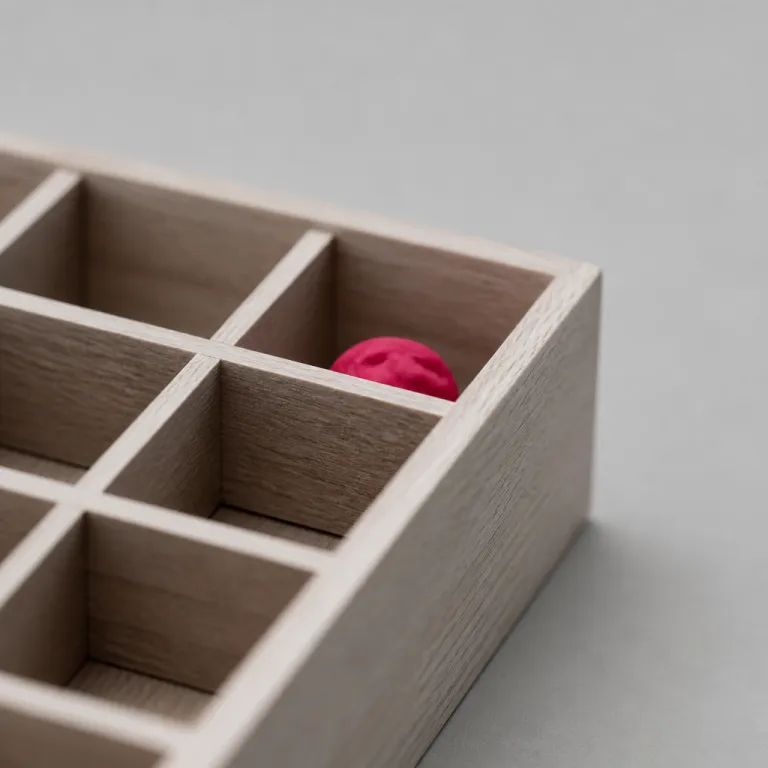
Pourquoi le bento grid s’est imposé dans le web design
The bento grid layout design CSS pattern did not appear by accident. It emerged because product teams needed a grid layout that could show many types of content while keeping a strong visual hierarchy and a readable structure. In practice, this bento layout combines flexible css grid capabilities with a bento box metaphor that users intuitively understand from everyday life.
On modern landing pages and dashboards, designers juggle metrics, text blocks, image cards, and call to action buttons. A bento grid lets each bento box grow or shrink in width and height while staying aligned on clean grid row and grid column tracks. Compared with older free form grids, this approach gives developers predictable rows and sections that are easier to maintain in code and easier to scale across products.
Unlike a masonry layout that stacks cards with irregular vertical gaps, a bento grid keeps rows aligned and preserves a clear reading order. This alignment matters for accessibility, because assistive technologies rely on logical content flow inside each div and child grid. When you treat every bento container as a semantic section with meaningful text and color contrast, you get both expressive design and robust responsive design.
Du dashboard au portfolio : un pattern devenu réflexe
Product teams at companies like Notion, Linear, and Apple use bento grids to present complex information without overwhelming users. On a dashboard, a large analytics bento box can use a row span of two while smaller cards share the remaining grid columns. On a portfolio, a hero image might stretch across several rows while supporting content sits in compact grids below.
Because css grid supports auto placement and grid template areas, the same bento layout can adapt from desktop to mobile with only a few media queries. Designers define which div class represents a primary module and which class bento elements are secondary, then developers translate that hierarchy into code. The result is a family of bento grids that feel consistent across pages but never rigid or repetitive.
For front end developers, this pattern also reduces one hidden cost of web design work. Instead of hand tuning pixel values for each row and column, you can rely on rem units, aspect ratio constraints, and shared width height tokens to keep modules aligned. Over time, that consistency across many bento grid implementations improves both maintainability and perceived quality.
Anatomie d’un bento container : structure, classes et hiérarchie
At the heart of any bento grid layout design CSS implementation sits a carefully structured bento container. This container is usually a parent div with a descriptive div class such as "dashboard-bento" or "product-bento" that defines the main css grid properties. Inside, each bento box becomes a child grid item with its own role in the overall visual hierarchy.
A typical structure for landing pages uses one wide hero bento box on the first row, followed by two or three smaller boxes on the next rows. Each box might contain an image, a short text span, and a button, grouped into semantic sections that screen readers can navigate. By mapping this hierarchy to HTML elements instead of anonymous div tags, you keep the design expressive while preserving accessibility.
Class naming matters more than many teams admit when they scale bento grids across a design system. A clear class bento naming convention, such as "bento-box--primary" or "bento-box--metric", helps developers understand which content deserves more width or a larger row span. When you later refactor the grid template or adjust the number of rows, these semantic classes make the change safer and more predictable.
Typographie, texte et rythme visuel dans chaque box
The power of a bento layout does not come only from its grid columns and rows. It also depends on how you orchestrate text, typography, and white space inside each bento box to guide the eye. For nuanced work on expressive headings inside these modules, many designers rely on principles similar to those discussed in this analysis of expressive typography as visual narration.
In practice, you might set a strong heading with a 2.4 rem font size, followed by a compact 1.4 rem description and a subtle label span. This internal rhythm ensures that even when the css grid rearranges boxes on smaller screens, each section still feels coherent and legible. Color choices inside each bento container should support this hierarchy, using restrained palettes so that the overall grid layout does not turn into a noisy patchwork.
When teams document these patterns in their design systems, they often pair layout tokens with typography tokens. That means defining shared rem values, line heights, and aspect ratio rules for images that appear across multiple bento grids. Over time, this alignment between content structure and visual hierarchy makes the pattern feel like a deliberate editorial system rather than a random collage.
Implémenter un bento grid en CSS Grid : du code aux détails
From a front end perspective, the bento grid layout design CSS pattern is a natural fit for css grid. A common starting point is to define a parent bento container with display grid, a grid template of repeat columns, and generous gap values. Developers then use grid row and grid column properties to control how each bento box spans across the layout.
On a three column desktop layout, you might define grid template columns as repeat(3, minmax(0, 1fr)) and rows as auto. A hero module could use grid column: 1 / span 2 and grid row: 1 / span 2, while secondary boxes use smaller row span values. This approach keeps the code readable, because each div class clearly indicates how much space a given piece of content should occupy.
Modern browsers also support subgrid, which lets a child grid inherit column or row definitions from its parent. In a bento layout, that means you can align text baselines and image edges across nested sections without redefining every width and height. For teams that care about pixel perfect web design, this subgrid capability finally closes the gap between design tools and production CSS.
Gestion des ratios, des unités et des typographies variables
One recurring challenge in bento grids is keeping images and cards visually balanced when content length varies. The aspect ratio property helps by locking each image or media block to a consistent proportion, such as 4 / 3 or 1 / 1, regardless of the actual width height on different screens. This stability prevents rows from jumping when text wraps or when content loads asynchronously.
Using rem units instead of pixels for padding, gaps, and font sizes ensures that the entire grid layout scales with user preferences. When combined with variable fonts, as explored in depth in this article on variable typography in web design, you can fine tune weight and width axes per bento box. That level of control lets you emphasize key metrics in one module while keeping supporting text lighter and more compact in others.
For developers, the goal is to keep the css code for these grids modular and predictable. Grouping shared properties in utility classes and using descriptive div class names for exceptions avoids the trap of one off overrides. When you later add new bento grids to other pages, you can reuse the same grid template and aspect ratio rules with minimal changes.
Responsive design : adapter un bento layout aux petits écrans
On large screens, the bento grid layout design CSS pattern shines with generous white space and multiple columns. The real test comes on mobile, where the same content must fit into a narrow width without losing its visual hierarchy. A thoughtful responsive design strategy treats the bento grid as a flexible system, not a fixed collage.
One effective approach is to define breakpoint specific grid templates that progressively reduce the number of columns. On tablets, a three column grid layout might collapse into two columns, while on phones each bento box becomes a full width row. During this transition, you can use the order property or explicit grid row definitions to keep the most important content near the top.
Accessibility adds another layer of complexity, because the visual order of bento grids must match the logical reading order. When you rearrange boxes for smaller screens, ensure that the HTML structure still flows in a meaningful sequence of sections. Screen reader users should encounter hero content, key metrics, and navigation in the same order that sighted users perceive in the responsive design.
Limiter la surcharge visuelle et gérer les interactions
One of the main risks with bento grids is visual overload when teams cram too many modules into a single layout. In practice, most dashboards and landing pages work best with eight to ten bento box elements per view, grouped into clear sections. Beyond that threshold, users struggle to parse the grid and start ignoring entire rows of content.
Interaction patterns must also adapt to screen size and input method. On desktop, hover states for each bento container can reveal secondary text or subtle color shifts, while on touch devices the same interactions should rely on tap or focus states. For customizable dashboards, drag and drop reordering of bento grids can be powerful, but it requires careful handling of focus, keyboard navigation, and aria attributes.
When you design these interactions, think of each bento box as a mini interface with its own micro layout. Buttons, icons, and text spans should align to the same internal grid row and column logic used at the macro level. That consistency helps users predict where to click, swipe, or tap, even as the overall grid layout changes across devices.
Bento grid vs masonry : alignement, lisibilité et ordre de lecture
Many designers initially confuse the bento grid layout design CSS pattern with masonry layouts. Both use multiple columns and variable height cards, but they differ radically in how they treat rows and alignment. A masonry layout lets cards stack freely, while a bento grid enforces shared baselines and deliberate row structures.
In a masonry system, each new card simply fills the next available vertical gap, which can create a dynamic but chaotic visual rhythm. By contrast, a bento layout uses explicit grid row and row span values to keep modules aligned in horizontal bands. This structure supports clearer visual hierarchy, because users can scan rows of related content instead of chasing cards across irregular columns.
Order of reading is another critical difference that affects both usability and accessibility. With a bento grid, the HTML structure usually mirrors the visual order, so assistive technologies and keyboard users follow the same sequence of sections. Masonry layouts often rely on JavaScript to reposition cards, which can break this alignment between DOM order and perceived order.
Cas d’usage : quand choisir un bento layout ou un masonry
For editorial feeds, mood boards, or inspiration galleries, masonry grids can still be the right choice. They excel when content is highly variable in height and when strict alignment between rows is less important than density. For product pages, dashboards, and marketing layouts, a bento grid usually offers better control over text, image placement, and call to action prominence.
On a complex web design project such as a vehicle registration flow, the bento pattern can clarify steps and options. A case study like this analysis of a seamless registration experience shows how structured modules reduce cognitive load. Translating that idea into a bento grid means grouping related actions into aligned boxes, each with consistent width, height, and content density.
When teams debate between these patterns, they should prototype both and run quick usability tests. Track how fast users locate key actions, how often they scroll past important rows, and how they describe the layout in their own words. In many cases, the bento layout wins because it feels intentional and calm, even when the underlying grids are complex.
Industrialiser le bento grid : design systems, tokens et maintenance
Once a team adopts the bento grid layout design CSS pattern, the next challenge is scaling it across products. Design systems play a central role here, turning one off bento grids into reusable components with shared tokens. Each bento container, box variant, and grid layout becomes a documented pattern rather than an improvised solution.
In practice, this means defining tokens for spacing in rem, standard width height combinations, and aspect ratio presets for images. You also need typography tokens for headings, body text, and labels that appear inside every bento box. When these tokens map directly to css variables and utility classes, developers can assemble new bento grids quickly without rewriting code.
Maintenance becomes easier when each div class follows a clear naming scheme that reflects both design intent and technical behavior. For example, a class bento label might indicate a small metadata span, while a bento-metric class signals a prominent numeric value. Over time, this shared vocabulary between designers and developers reduces ambiguity and speeds up code reviews.
Vers des bento grids plus responsables et plus accessibles
As bento grids become a default pattern in web design, teams must also consider performance and inclusivity. Large images inside multiple bento boxes can quickly inflate page weight, so responsive images, lazy loading, and careful color contrast choices are essential. Each section should remain readable even when users increase text size or switch to high contrast modes.
Accessibility experts often remind teams that visual hierarchy must align with semantic hierarchy. That means using headings, lists, and landmark roles inside each bento container instead of relying solely on styled div elements. When the grid layout changes at different breakpoints, these semantics ensure that assistive technologies still present a coherent story.
In the end, the success of any bento layout depends less on trendy aesthetics than on how well it serves real tasks. Teams that treat bento grids as a flexible editorial system, grounded in content strategy and user research, tend to ship interfaces that age gracefully. Those who chase the look without respecting structure, hierarchy, and responsive design often end up with fragile, confusing rows of content.
Chiffres clés sur l’adoption des bento grids et de CSS Grid
- According to the CSS-Tricks State of CSS survey, more than 90 % of respondents report using css grid in production projects, showing that grid layout techniques are now mainstream rather than experimental.
- Analytics from major design galleries such as Awwwards and Behance indicate that grid based hero layouts and bento style sections appear on a majority of featured landing pages, reflecting a strong shift toward modular web design.
- Performance audits by the Chrome team have shown that native css grid implementations are significantly more efficient than JavaScript based layout polyfills, which encourages teams to adopt bento grids without fearing runtime overhead.
- Accessibility reviews from organizations like WebAIM highlight that interfaces with clear visual hierarchy and aligned rows tend to produce fewer navigation errors for screen reader users than irregular masonry layouts.
- Design system documentation from large companies such as Microsoft, IBM, and Shopify increasingly includes bento layout patterns, confirming that this approach has moved from trend to standard practice in enterprise products.
FAQ sur le bento grid et le CSS Grid
What is a bento grid in web design ?
A bento grid in web design is a modular grid layout where content is organized into boxes of different sizes that still align on shared rows and columns. It uses css grid to control width, height, and row span for each module. The pattern is inspired by Japanese bento boxes, which separate food into distinct but related compartments.
How is a bento layout different from a masonry layout ?
A bento layout keeps rows aligned and uses explicit grid row and grid column definitions, while a masonry layout stacks cards wherever space is available. This alignment makes bento grids easier to scan and more predictable for users. It also helps maintain a logical reading order that matches the underlying HTML structure.
When should I use a bento grid on my site ?
Bento grids work best on landing pages, dashboards, portfolios, and product pages where you need to present several types of content at once. They are especially effective when you want a strong visual hierarchy without sacrificing responsive design. If your content is highly irregular or purely exploratory, a masonry layout might be more appropriate.
Which CSS properties are essential for building a bento grid ?
The essential CSS properties for a bento grid include display: grid, grid-template-columns, grid-template-rows, gap, and grid-column or grid-row for spans. Many implementations also use aspect-ratio, minmax, and responsive units like rem for spacing. For more advanced layouts, subgrid and nth-child selectors help keep internal alignments consistent.
Are bento grids accessible for screen reader users ?
Bento grids can be accessible if you respect semantic HTML, maintain a logical DOM order, and ensure sufficient color contrast. Each bento box should use appropriate headings, landmarks, and text alternatives for images. Problems usually arise only when visual rearrangements break the relationship between the grid layout and the reading order.