Why iOS application development starts with design decisions
Design for any mobile app in the Apple ecosystem begins long before a single line of code. Thoughtful iOS app development requires aligning business goals, user expectations, and technical constraints into one coherent product vision. When teams skip this early design phase, mobile applications often feel fragmented, inconsistent across devices, and harder to evolve.
On iPhone and iPad, every mobile application competes for attention in the App Store, so visual clarity and user experience quality directly influence downloads and reviews. Strong iOS development practice treats user interface design as a strategic asset, not a decorative layer added after engineering. This mindset also shapes how you approach cross-platform choices such as React Native, Flutter, or fully native Swift when planning complex mobile apps.
Designers working on products that span both iOS and Android must understand Apple’s Human Interface Guidelines as deeply as Material Design on Android. The same feature in a mobile application can feel elegant on iOS yet clumsy on Android if the user interface ignores platform conventions. Respecting these differences while maintaining a shared brand language is the core challenge of modern mobile app design, as seen in real-world products like ride-hailing apps that adapt navigation, maps, and payment flows to each platform while preserving a unified identity.
Structuring user experience for iOS, Android, and cross platform apps
Information architecture is the skeleton of any mobile app, and it shapes how quickly users reach value. In iOS app development, navigation patterns such as tab bars, navigation stacks, and sheets must be planned before a single screen mockup. When the structure is clear, mobile applications feel intuitive even as features grow in number and complexity.
Teams working on both iOS and Android products often ask whether to prioritize native or cross-platform frameworks. React Native and Flutter allow a shared codebase for Android and iOS, but user experience still needs platform-specific adjustments for gestures, typography, and system components. A well-designed mobile app respects iOS expectations like swipe back, safe areas, and Dynamic Type while still aligning with Android patterns such as the system back button and platform-specific navigation.
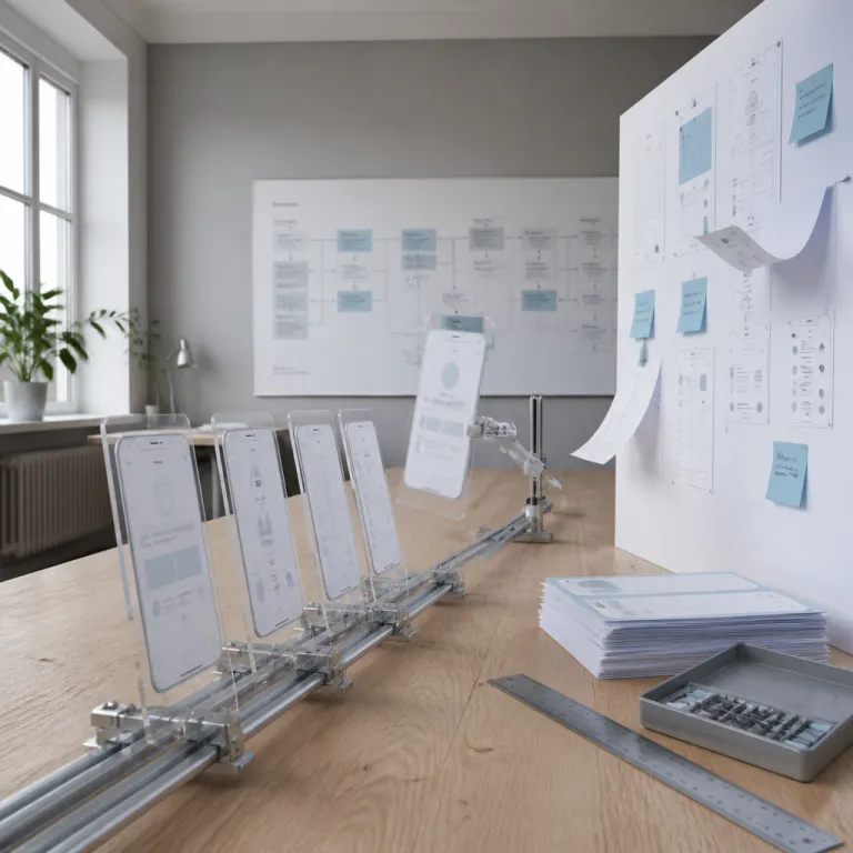
During app development, designers should collaborate in real time with developers using tools such as Visual Studio Code, Xcode, or Android Studio. This close collaboration helps translate interaction flows, micro-animations, and push-notification logic into reliable code for mission-critical mobile applications. For deeper guidance on structuring flows and reducing friction, studying an in-depth guide on enhancing user experience in application design can help refine decisions for both web and mobile application projects, and teams can turn these insights into practical checklists covering navigation depth, error recovery paths, and cross-platform parity.
Visual language, color psychology, and user interface on iOS
Visual design in iOS app development is not only about aesthetics; it is about cognitive load and clarity. Color, typography, and spacing guide attention through mobile apps and influence how trustworthy a mobile application feels. When these elements are inconsistent, users hesitate and conversion drops even if the underlying engineering is technically solid.
On Apple devices, user interface design must balance brand identity with native components such as SF Symbols, system typography, and default controls. Designers working on cross-platform products for Android and iOS often start with a shared design system, then create iOS-specific variants for buttons, alerts, and navigation bars. This approach keeps mobile apps recognizable while respecting Apple developer guidelines and App Store review expectations.
Color choices in mobile applications affect perceived speed, safety, and emotional tone across both web and mobile experiences. For teams refining palette decisions in iOS development or Android and Flutter projects, a dedicated resource on the psychology of colors in mobile application design offers practical frameworks. Applying these principles consistently across every mobile app screen, from onboarding to push-notification settings, reinforces trust and reduces user fatigue, as illustrated by fintech apps that use calm neutrals for account overviews and high-contrast accent colors only for critical actions like transfers or card freezing.
Choosing between native, React Native, and Flutter for iOS design
Framework choice has a direct impact on design possibilities in iOS app development projects. Native Swift or SwiftUI gives the highest fidelity to Apple platform patterns, while React Native and Flutter trade some platform nuance for shared code and faster delivery. The right decision depends on product scope, team skills, and how tightly the user interface must align with iOS conventions.
React Native integrates well with existing web development teams familiar with React, which can help when mobile applications share logic with web dashboards or admin tools. Flutter, by contrast, offers a powerful rendering engine that keeps design consistent across iOS and Android, but designers must recreate many native patterns manually. For complex mobile applications that rely on advanced animations or real-time visualizations, Flutter can provide smoother performance at the cost of extra design effort to match Apple guidelines.
When a company maintains several mobile apps, a cross-platform strategy can reduce maintenance while still allowing targeted native modules for sensitive features. For example, a banking mobile app might use React Native for general flows but rely on native iOS development components for secure authentication and Apple Pay integration. Another common pattern is a retail application that uses Flutter for catalog and search while embedding native iOS modules for camera-based barcode scanning and Wallet passes, ensuring that high-risk or hardware-intensive features feel perfectly aligned with Apple’s interaction model.
Designing for real time interactions, notifications, and multi device contexts
Modern iOS app development rarely concerns static content; users expect real-time feedback, live data, and seamless transitions. This expectation affects how designers plan loading states, skeleton screens, and error messages in mission-critical mobile applications. When feedback is clear and timely, an application feels responsive even if network conditions fluctuate.
Push notifications are another crucial design surface in app development, not just a technical add-on. Poorly designed notifications in mobile apps lead to opt-outs and uninstalls, while thoughtful timing, copy, and grouping increase engagement without overwhelming users. On Apple devices, designers must respect system rules for notification previews, Focus modes, and badges to keep the mobile app aligned with user privacy expectations.
Many mobile applications now span iPhone, iPad, Apple Watch, and sometimes web dashboards, which complicates user interface decisions. A fitness mobile application, for example, might show detailed analytics on the web, quick summaries on iOS, and glanceable metrics on a watch companion app. Designing these ecosystems requires mapping user journeys across platforms so that Android, iOS, and Apple Watch experiences complement rather than duplicate each other, with clear rules for which device owns long-form tasks, which handles alerts, and which focuses on at-a-glance status.
Typography, layout systems, and accessibility in iOS app design
Text is the primary interface in many iOS app development projects, yet typography is often treated as an afterthought. On Apple devices, Dynamic Type, line height, and contrast ratios directly influence readability and perceived quality in mobile applications. When designers ignore these fundamentals, even a visually polished mobile app becomes tiring to use.
Building a robust layout system for mobile apps means defining spacing scales, grid rules, and component variants that adapt gracefully to different screen sizes. This is especially important for cross-platform products where Android and iOS devices have varied aspect ratios and pixel density. A consistent system also accelerates app development because developers can implement reusable patterns instead of one-off layouts.
Accessibility is not optional in modern mobile applications, particularly in regulated sectors such as finance, health, or public services. Designers must plan for VoiceOver, larger text, sufficient hit areas, and motion reduction options from the earliest iOS development stages. For teams refining their typographic systems, a detailed reference on variable fonts and flexible typography in digital design can help align web and mobile application experiences under one coherent visual language, and a simple checklist covering minimum 44×44 pt touch targets, WCAG contrast ratios, and support for system text-size settings keeps accessibility requirements visible during every design review.
Key statistics on mobile app design and iOS usage
- According to Apple’s App Store figures for 2023, the store hosts more than 1.8 million mobile apps worldwide, which raises the design bar for every new mobile application competing for visibility. This volume means that even small improvements in onboarding, navigation clarity, and visual polish can significantly affect whether an iOS app stands out or disappears in search results.
- Data from Statista’s 2023 digital media usage report shows that mobile applications account for over 70% of total digital media time in the United States, confirming that investment in iOS and Android app design directly affects overall brand perception. When most customer interactions happen through mobile apps, weak interaction design or confusing flows quickly erode trust.
- Research by Google on mobile site performance, updated in 2022, indicates that 53% of users abandon a mobile app or web page if loading takes longer than three seconds, which makes real-time feedback and perceived performance critical design priorities. Designers can respond by using skeleton screens, optimistic UI patterns, and clear retry options instead of static spinners.
- Accessibility studies from the W3C Web Accessibility Initiative estimate that more than one billion people live with some form of disability globally, highlighting why inclusive user interface design in mobile applications is both an ethical and business imperative. Supporting assistive technologies and high-contrast modes expands the reachable audience and reduces legal risk.
- Push notifications can increase mobile app retention by up to 190% for highly engaged segments, according to data from Airship’s 2022 benchmark report, but only when notifications are carefully designed, personalized, and timed. This makes notification strategy a core part of UX design rather than a last-minute marketing add-on.
FAQ about iOS application design and development
How is iOS app design different from Android app design ?
iOS app design follows Apple’s Human Interface Guidelines, which emphasize clarity, depth, and deference to content, while Android design follows Material Design with different navigation patterns and component styles. Designers working on iOS app development must respect platform-specific gestures, typography, and system controls to avoid a generic cross-platform feel. When a product targets both iOS and Android, teams often maintain a shared design system with platform variants for key components.
Should I choose native iOS, React Native, or Flutter for my project ?
Native iOS development with Swift or SwiftUI offers the best integration with Apple services and the most precise user interface control. React Native suits teams with strong React and web skills who want to share logic across mobile applications and web dashboards. Flutter is attractive for visually rich cross-platform apps, but designers must invest more effort to align its widgets with iOS conventions.
How important is user experience in App Store performance ?
User experience strongly influences ratings, reviews, and retention, which in turn affect App Store ranking and visibility. A well-designed mobile app with clear onboarding, responsive interactions, and respectful push notifications tends to generate higher engagement metrics. These signals help the App Store algorithm surface the application to more relevant users over time.
What are the main steps in designing an iOS mobile application ?
The main steps include research and user interviews, definition of user journeys, information architecture, low-fidelity wireframes, high-fidelity user interface design, interactive prototypes, and iterative testing on real devices. Throughout iOS app development, designers collaborate with developers to ensure that visual and interaction details survive implementation. After launch, analytics and user feedback guide continuous improvements to the mobile app.
How can I ensure accessibility in my iOS app design ?
Ensuring accessibility requires using Dynamic Type, sufficient color contrast, large touch targets, and clear focus states, as well as supporting VoiceOver and motion reduction preferences. Designers should test mobile applications with assistive technologies on real devices, not only in design tools. Integrating accessibility criteria into design reviews from the earliest application design stages prevents costly rework later.