Spatial UI design profondeur interface : poser le cadre pour les designers produit
Spatial UI design, or profondeur d’interface, describes interfaces that organize information across several depth levels instead of a single flat canvas. You orchestrate layers, z levels and transitions that feel physically coherent so that users can read, scan and prioritize content across screens with less effort and less time spent decoding layout tricks.
For a UX/UI designer, the main challenge is to make this three dimensional interface serve comprehension rather than spectacle. Depth must work comme une lettre bien dessinée : chaque courbe guide l’œil, chaque espace blanc laisse le temps de respirer. When you add 3D previews, parallax or glassmorphism, you implicitly set expectations about realism, feedback and continuity that will influence how each individual interprets the interface.
Think of Liquid Glass on iOS: the interface behaves like a living material that reacts to light, motion and context. These features require a mental model closer to industrial design than to classic flat UI, because the interface feels like a surface you can press, bend or fill with content. Your role is to translate that material illusion into clear interaction patterns that any individual can understand in a fraction of a second, even when the screen is busy or the device is under load.
From flat screens to layered spaces
Spatial UI is not reserved for headsets or VR labs anymore. E‑commerce product pages now present 3D models that rotate, zoom and cast subtle shadows on a blurred background layer. Mapping tools stack interactive layers of data, from heatmaps to routes, creating depth that clarifies complex information instead of hiding it, provided that the levels are intentionally set and not added as decorative noise.
To keep control, you need to set explicit depth rules for your design system. Define which components live on the base plane, which ones float above as cards, and which ones slide from behind as full screen panels. This hierarchy of levels is your proof that depth is intentional, not a last‑minute visual effect, and it gives engineers a concrete solution they can implement consistently.
Every new layer you add will increase cognitive load and technical load at the same time. That is why a robust component library, shared motion tokens and performance budgets become strategic resources rather than optional documentation. When these foundations are clearly presented to the équipe produit, spatial interfaces stop being a visual gimmick and start becoming a repeatable solution that can scale across features without exhausting team resources.
Liquid Glass et interfaces matérielles : quand la profondeur devient comportement
Liquid Glass on iOS popularized the idea of an interface that behaves like a semi‑liquid material. Panels stretch, blur and refract content underneath, giving depth a tactile quality even on a small mobile screen. This approach changes how users anticipate motion, friction and feedback when they tap or drag, because the interface feels less like a static layout and more like a responsive surface.
In a product workflow, this means your motion design is no longer a cosmetic layer added at the end. The way a card deforms, the time it takes to return to its resting state, and the easing curve you set all communicate hierarchy and intent. A slow, elastic rebound suggests a soft material, while a sharp snap back feels like rigid glass that requires precise control and signals that the interaction is complete.
During the last UX Days Paris (2023), several talks on intentionality and responsibility in design highlighted this shift toward material metaphors. Speakers such as Stéphanie Walter and Laurent Gille discussed how spatial depth and motion create expectations about reliability, latency and error states. When you design with spatial depth in mind, you implicitly propose a contract about how the interface will react under stress, rapid taps or poor network conditions. That contract must hold even when the app is under heavy load or when animations are reduced in the accessibility settings.
Designing depth as a system, not as a dribble shot
To avoid gimmicks, treat Liquid Glass like any other design token in your system. Define opacity ranges, blur radiuses and elevation levels that map to semantic meanings such as focus, background or modal. For example, you might set a base blur of 8 px for navigation bars, 16 px for modals and 24 px for critical alerts, with corresponding elevation tokens. This systematic approach gives your équipe a shared language to talk about depth without relying on vague adjectives.
Performance is the hidden challenge behind every spatial interface. Each blur, shadow and parallax effect will require GPU work, which can quickly drain battery and degrade scrolling if you ignore constraints. A good rule is to prototype early on real devices and measure frame times while you interact like real users, not just while you admire static screens. Simple tools such as Xcode Instruments or Android Profiler will show whether your proposed depth system stays close to 16 ms per frame on devices like the iPhone 12 or mid‑range Android phones.
When you present your work to stakeholders, bring both visual explorations and performance metrics. Showing that your proposed depth system keeps frame rates stable is a concrete proof of design maturity. For example, one internal benchmark at a retail app team compared a flat product list to a layered version with blur and elevation; the spatial variant stayed above 55–60 fps on an iPhone 12 and a Pixel 5 while improving perceived clarity in tests. It also reassures engineering that the solution respects technical resources instead of pushing them to the limit for a short‑lived wow effect.
Pour un retour détaillé sur ces enjeux d’intentionnalité et de responsabilité dans les interfaces, vous pouvez lire ce retour d’expérience sur les UX Days, qui met en perspective ces approches matérielles.
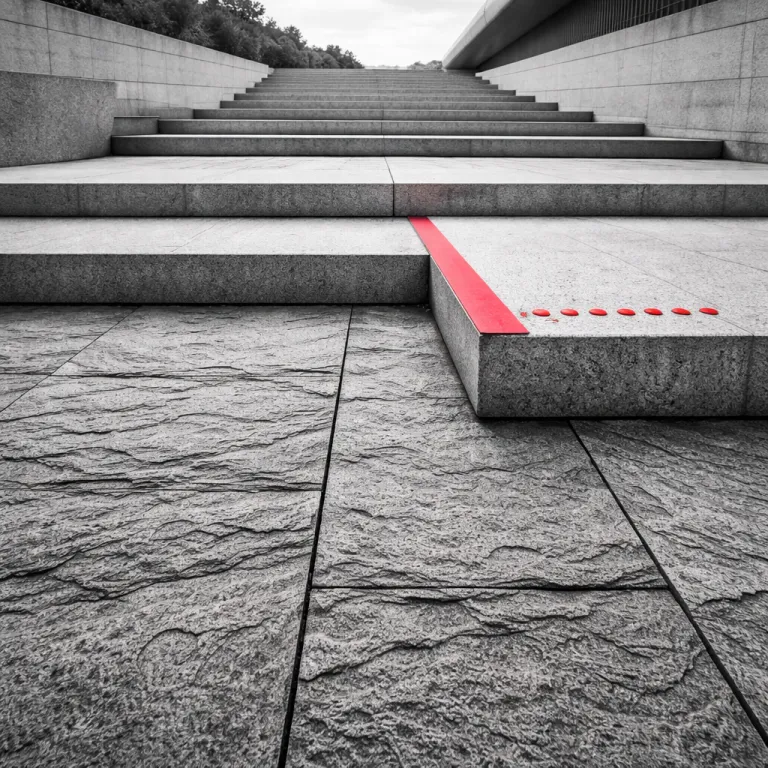
Bento grid, cartes en relief et spatial UI design profondeur interface
The Bento grid pattern, with its rounded cards and modular layout, is a natural host for spatial UI. Each card can behave like a small object resting on a surface, casting a soft shadow and reacting to hover or tap with a subtle lift. This gives users a clear sense of which element is active without relying solely on color or borders, and it makes the overall composition feel like a set of tangible pieces rather than a flat collage.
When you combine Bento grids with depth, you can set multiple interaction levels inside the same screen. Primary actions live on the top plane as prominent buttons, while secondary information stays slightly recessed, almost engraved into the background. This hierarchy helps an individual scan quickly, because the interface visually answers the question of what will happen first when they interact and which elements will stay in place.
Some teams go further and use clay or jelly‑like buttons that deform on press, reinforcing the material metaphor. These features require careful tuning of animation time and distance to avoid a toy‑like feeling that slows down expert workflows. The goal is to make the interface feel responsive and alive without making every click look like a cartoon or turning each micro‑interaction into a distraction.
Depth, typography and the narrative role of the letter
Depth is not only about cards and shadows, it also affects typography. When you treat the letter as a spatial object, you can use expressive type to guide attention across planes. A bold heading that slightly overlaps a blurred background image can act as a bridge between content layers and signal which part of the story the user should focus on first.
In a spatial interface, typographic hierarchy becomes a structural tool to organize levels of meaning. You might set primary headings on the top plane, secondary labels embedded into surfaces, and microcopy almost engraved into controls. This multi‑plane strategy helps users understand which words are actionable and which ones are pure context, reducing the time they need to parse each screen.
For a deeper dive into how expressive typography turns each letter into visual narration, explore this article on typographie expressive. It shows how the shape, weight and placement of a letter can fill gaps in meaning that layout alone cannot cover. Applied to spatial interfaces, this thinking prevents you from treating text as a flat overlay pasted on top of 3D effects and encourages you to design type and depth as a single narrative system.
Performance, accessibilité et preuves de valeur pour la profondeur
Every layer you add in a spatial interface has a cost in performance and accessibility. Shadows, blurs and parallax effects increase rendering work, which can slow down older devices or low‑power laptops. At the same time, too much visual complexity can overwhelm users with cognitive or visual impairments, making it harder for them to locate key actions in time.
A responsible approach starts with clear performance budgets and accessibility settings defined at the design stage. Decide how much animation time is acceptable for critical flows, and which effects must be disabled when the user activates reduced motion preferences. This proactive stance turns accessibility from a late fix into a core part of your spatial strategy and gives your team a concrete set of constraints instead of vague intentions.
To build proof that your depth system actually helps, run comparative tests between flat and layered versions of the same flow. Measure task completion time, error rates and subjective workload using tools like the NASA TLX questionnaire. In one e‑commerce case study presented at UX Days Paris 2022 by an apparel retailer, a layered product configurator reduced decision time by 18 % while keeping error rates stable, showing that depth can be a measurable solution rather than a distraction when it is carefully scoped.
Designing for different attention levels and device constraints
Not all contexts require the same depth intensity, so think in terms of attention levels. A dashboard used all day by expert users might need restrained depth, focusing on clarity and quick scanning. A marketing landing page can afford more expressive spatial effects, because its primary goal is emotional impact and storytelling rather than rapid data entry.
Device constraints also shape how far you can push depth. On low‑end phones, you may need to reduce blur strength, simplify shadows and limit the number of overlapping layers to keep load times acceptable. On high‑end tablets or desktops, you can safely present richer textures and more nuanced parallax without sacrificing responsiveness, as long as you keep monitoring frame times and memory usage.
Whatever the device, always provide settings that let individuals tune motion and contrast to their comfort. This respect for user control is a strong signal of trustworthiness, showing that you value long‑term usability over short‑term visual spectacle. In the end, the best spatial interfaces are those that quietly adapt to the person in front of the screen and make the work they are trying to do feel lighter, not heavier.
Pour approfondir la manière de cadrer ces arbitrages sans tomber dans le rituel creux, ce guide sur le design thinking appliqué avec intention offre un cadre utile pour vos décisions de profondeur.
Processus, ressources et collaboration pour des interfaces en trois dimensions
Spatial UI design profondeur interface ne se construit pas en solo dans Figma. It requires tight collaboration between design, engineering and product to align on constraints, behaviors and performance targets. Without this shared understanding, depth effects risk breaking under real data or edge cases and will quickly be perceived as fragile features instead of a robust solution.
Start by setting a dedicated exploration phase in your roadmap, with clear time boxes and success criteria. During this phase, your équipe can prototype multiple depth concepts, from subtle elevation changes to full 3D product previews. Each concept should be presented with both visual assets and a short rationale explaining how it will improve comprehension or reduce errors for users, plus a rough estimate of the resources required to build and maintain it.
As you converge, document your spatial system like you would document color or typography. Define elevation levels, motion patterns, and interaction states as reusable tokens that developers can implement once and apply everywhere. A simple table that lists elevation tokens (e.g. level‑1: base surfaces, level‑2: cards, level‑3: modals) and associated blur and shadow values will make it easier for teams to fill new screens with consistent depth without reinventing rules.
From individual experiments to a coherent spatial language
Many teams start with isolated experiments, such as a single 3D product viewer or a parallax hero section. The real challenge is to transform these isolated pieces of work into a coherent spatial language across the entire interface. That means aligning how modals appear, how drawers slide, and how cards lift on interaction so that users can transfer their mental model from one feature to the next.
To achieve this, treat each new spatial feature as a hypothesis that must be tested and refined. Ask what problem it is trying to solve, what resources it consumes, and how it interacts with existing patterns. Over time, you will build a body of proof that shows which depth patterns consistently help and which ones only add noise, and you will be able to retire experiments that do not deliver measurable value.
When you present this evolution to stakeholders, frame it as a move from scattered visual tricks to a robust, system‑level solution. Emphasize how a consistent spatial UI design profondeur interface reduces onboarding time for new users and simplifies maintenance for l’équipe technique. In the long run, this disciplined approach is what turns three‑dimensional interfaces from a trend into a sustainable design practice that supports both user needs and business goals.
FAQ
How do I decide when to use spatial UI design profondeur interface in a product ?
Use depth when it can clarify hierarchy, relationships or states that are hard to express on a single flat plane. Good candidates include complex dashboards, product configurators and maps with multiple data layers where users must compare several levels of information at the same time. Avoid heavy spatial effects when the task is short, high stakes or requires maximum speed, because extra visual complexity can slow decision making and increase cognitive load.
What tools are best suited to prototype interfaces with depth and 3D effects ?
Most designers start with Figma or Sketch for layout, then use tools like Principle, ProtoPie or After Effects to prototype motion and depth transitions. For real‑time 3D previews, WebGL frameworks such as Three.js or engines like Unity can be integrated into web or mobile prototypes. The key is to test on real devices early, because desktop previews often hide performance issues such as long initial load or dropped frames when users scroll quickly.
How can I keep spatial interfaces accessible for users with motion sensitivity ?
Respect system‑level reduced motion settings and provide in‑app controls to tone down or disable non‑essential animations. Prefer short, purposeful transitions that explain spatial relationships instead of long decorative sequences. Always ensure that hierarchy and meaning remain clear through contrast, typography and layout even when most motion is turned off, so that individuals who disable animation still receive a complete and coherent experience.
Does adding 3D product previews always improve e‑commerce conversion ?
3D previews can help when they answer real questions about size, texture or fit that photos cannot cover. They tend to work best for complex or high‑value products, where users are willing to spend more time exploring details and comparing options. For simple, low‑involvement items, heavy 3D viewers may increase load time without adding enough perceived value, so you should validate the impact with targeted experiments before rolling them out widely.
How do I measure the impact of depth on user experience and business metrics ?
Run A/B tests comparing flat and spatial versions of the same flow, and track metrics such as task completion time, error rates and satisfaction scores. Combine quantitative data with qualitative feedback from usability tests to understand why depth helps or hurts, and document the results so they can inform future decisions. Over several iterations, this evidence will guide which spatial patterns to keep, refine or remove, turning depth from a visual trend into a tested design asset.