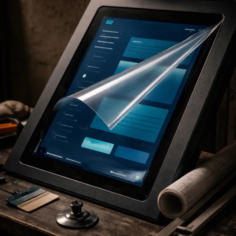
Hiérarchie visuelle : quand le contraste structure l’expérience, pas seulement le style
Every strong user interface starts with a clear visual hierarchy that serves the user before serving the brand. When you treat hierarchy as one of your core design principles rather than a cosmetic layer, you create interfaces that work well across trends, devices, and visual fashions. Good hierarchy lets users scan complex digital products quickly, understand what matters, and act with confidence.
At the heart of ui design bonnes pratiques, contrast is the principle that quietly does the heavy lifting. You combine contrast in size, weight, color, and spacing to draw attention to primary actions, then you use softer contrasts for secondary design elements and background content. Designers who learn design with this mindset stop decorating screens and instead orchestrate information so that every user experience feels intentional.
Think of a checkout flow in an e commerce product where the primary button, supporting text, and reassurance messages all compete visually. When contrast is misused, the user must read every line of text to understand the next step, which breaks the promise of a good interface and slows the experience design. When you apply design principles with discipline, you keep the main action dominant, group related elements through proximity, and let subtle typography guide users without shouting.
Gestalt laws remain principles top for interface design, even when the visual language shifts from skeuomorphism to flat design or to brutalist designs. Proximity, similarity, and continuity help users build mental models of the interface, because the brain reads grouped elements as related functions. These laws are not trends ; they are cognitive shortcuts that help users process dense content and complex user interfaces faster.
On dashboards or SaaS tools, a strong hierarchy means that key KPIs and alerts draw attention immediately, while secondary filters and settings stay visually quieter. Designers who learn design in data heavy environments quickly understand that spacing and alignment are as critical as color when you want to keep users focused on the right task. This is where ui design bonnes pratiques move from theory to measurable impact on task completion and error rates.
To stress test your hierarchy, remove color from your designs and review them in grayscale. If the structure of your user interface still feels obvious, your contrast, spacing, and typographic scale are doing their job as design best practices. When everything collapses into a flat gray mass, you know that your reliance on color trends has masked weak underlying design principles.
Lisibilité et typographie : les chiffres qui ne suivent pas les modes
Readable text is the quiet backbone of every good design, especially in content heavy products where the interface is mostly words. While visual trends push designers toward ultra light fonts or extreme letter spacing, ui design bonnes pratiques remind us that human eyes have hard limits. You can experiment with style, but you cannot negotiate with physiology.
For body text on desktop, a minimum of 16 px with a line height around 1.5 remains one of the most robust design principles in modern interface design. This range supports comfortable reading distances and helps users scan content without losing their place, especially when lines stay between 50 and 75 characters. When designers push below these thresholds to follow minimalist designs, they trade user experience for aesthetics and quietly increase cognitive load.
On mobile, the same logic applies, even if the exact pixel values shift with device density. A user reading long form content or complex product documentation on a small screen needs generous line height, sufficient contrast, and margins that keep text away from the edges. If you keep these principles top of mind, you help users stay engaged longer and reduce the need for constant zooming or re reading.
Expressive typography has its place, especially in marketing pages or editorial designs where the goal is to draw attention and create emotion. Yet even there, ui design bonnes pratiques ask you to separate decorative display type from functional text that carries instructions, labels, or error messages. A good interface lets expressive headlines coexist with highly legible body text, each serving a different layer of the experience design.
When you work on interfaces where text is the main design element, such as reading apps or knowledge bases, you should treat typographic systems as part of your core design best practices. Establish clear rules for headings, body, captions, and interactive text states, then test them with real users and real content. For a deeper dive into how letterforms can carry narrative weight without sacrificing clarity, you can study this piece on expressive typography as visual narration.
Accessibility guidelines reinforce these ui design bonnes pratiques by grounding them in measurable contrast ratios and minimum sizes. When designers align interface design with standards such as WCAG, they do not only help users with disabilities ; they improve the overall user experience for everyone. In practice, this means checking color contrast for text, avoiding pure gray on white combinations, and ensuring that interactive design elements remain legible under different lighting conditions.
Affordance et feedback : pourquoi un bouton doit rester un bouton
Trendy visual styles like glassmorphism, brutalism, or ultra minimalism tempt designers to reinvent basic interface components. Yet ui design bonnes pratiques insist that affordance and feedback remain non negotiable, because they directly shape how a user understands what can be clicked, dragged, or typed. A button that looks like plain text may feel elegant in a static mockup, but it often fails as a functional design element in a live product.
Affordance means that the visual treatment of an interface component suggests its possible actions, such as pressing, sliding, or expanding. When you design a good interface, you use shadows, borders, and micro animations to signal clickability, even if the overall style leans flat or experimental. Users should not have to learn design theory to understand where to tap or what will happen next.
Feedback is the second half of this principle, closing the loop between user action and system response. A button that changes state, a loading indicator that appears quickly, or a subtle vibration on mobile all help users feel that the interface works well and respects their time. Without clear feedback, even a visually stunning user interface can feel broken or untrustworthy.
Motion design has become a powerful tool for reinforcing affordance and feedback in digital products. When used with restraint, micro interactions can draw attention to key actions, confirm successful operations, or gently highlight errors without overwhelming the content. For practical examples of how animation supports user experience rather than distracting from it, explore this analysis on how motion design transforms interfaces and user experience.
In complex tools such as design systems or enterprise dashboards, consistent affordance patterns help users transfer knowledge from one part of the product to another. If primary actions always share the same visual language and feedback timing, users build trust and move faster through the interface. This is where ui design bonnes pratiques intersect with experience design at scale, turning individual screens into coherent journeys.
When you evaluate new visual trends, ask whether they strengthen or weaken affordance and feedback for real users. A design that looks fresh but hides interactive elements behind ambiguous icons or low contrast text is not good design, regardless of its popularity on galleries. The most resilient design principles are those that help users feel in control, informed, and supported at every step.
Consistance, design systems et tokens : la cohérence comme filet de sécurité
As products grow, consistency stops being a nice to have and becomes a survival requirement for both users and designers. A coherent user interface reduces the mental effort required to navigate new sections, because familiar patterns and design elements behave predictably. Ui design bonnes pratiques treat consistency as a principle that protects the user experience from the chaos of incremental features and shifting teams.
Design systems, with their components, tokens, and guidelines, are the operational form of these design principles. When you define colors, spacing, typography, and interaction states as reusable tokens, you help designers and developers create interfaces that work well together, even across different squads or platforms. This shared language also makes it easier to keep accessibility and performance in mind, because improvements propagate through the system instead of staying local.
However, a design system is not an end in itself ; it is a tool that should help users, not a rigid framework that blocks experience design. The best practices emerge when teams treat the system as a living product, regularly auditing real screens, user feedback, and analytics to refine components. In this sense, ui design bonnes pratiques encourage designers to learn design from actual usage rather than from static documentation alone.
Public sector and territorial services offer strong case studies of how consistency supports trust in digital interfaces. When citizens move from one online service to another and encounter the same navigation patterns, form layouts, and feedback messages, they feel that the institution respects their time and cognitive effort. For a concrete example of this approach, you can read this interview on design serving public action in metropolitan services.
From a team perspective, consistent interface design also accelerates onboarding for new designers and developers. When the design best practices are encoded into components and documented patterns, people can focus on solving real user problems instead of reinventing buttons or form fields. This is how ui design bonnes pratiques scale from individual screens to entire product ecosystems.
Consistency does not mean uniformity, though ; it means predictable variation anchored in clear principles top. You can adapt components for different contexts, brands, or devices while keeping core behaviors and feedback stable for users. The art lies in balancing flexibility with structure so that every new feature feels like part of the same product family, not a foreign object.
Navigation et architecture : les patterns qui survivent aux tendances
Navigation is where ui design bonnes pratiques collide most visibly with fashion, because menus and layouts often carry the strongest visual signatures of a trend. Yet when you look at products that age gracefully, you notice that certain navigation patterns persist while others fade quickly. Tabs, breadcrumbs, and prominent search bars remain reliable tools, whereas desktop hamburger menus or infinite scroll without pagination often create more problems than they solve.
Good navigation starts with a clear mental model of the product, not with a clever animation or an unusual layout. Designers who keep users at the center of their decisions map real tasks, content types, and user journeys before choosing interface patterns. This approach turns navigation into a layer of experience design that supports goals, rather than a playground for visual experimentation.
Tabs work well when you have a small number of top level sections that users need to switch between frequently. Breadcrumbs shine in deep content structures, such as knowledge bases or e commerce catalogs, where users must understand where they are and how to move up a level. Search becomes a primary navigation element in products with large or dynamic content sets, especially when combined with filters and smart suggestions.
Infinite scroll, by contrast, often undermines ui design bonnes pratiques when used without clear boundaries or secondary navigation. Users lose their sense of progress, cannot easily return to previous items, and struggle to share specific positions in the content. Pagination or “load more” patterns, while less flashy, offer better control and align more closely with principles top of user experience.
When you design navigation for complex digital products, you should test structures with real users using tree testing or card sorting. These methods help you validate whether your labels, groupings, and paths match how people think about the content, rather than how your internal équipe organizes work. The result is a user interface that feels intuitive even when the underlying information architecture is intricate.
Across all these choices, ui design bonnes pratiques remind us that navigation is a means, not an end. A good interface quietly guides users to their goals, surfaces relevant content at the right moment, and reduces the number of decisions required on each screen. When in doubt, choose patterns that have proven to help users over time, even if they look less innovative in a static portfolio.
Modernité visuelle vs qualité d’usage : arbitrer entre tendance et durabilité
One of the hardest tensions for designers is balancing the desire for visual modernity with the responsibility to deliver robust user experience. Ui design bonnes pratiques do not reject trends outright, but they ask you to evaluate them through the lens of usability, clarity, and long term maintainability. A design that feels slightly dated yet remains crystal clear often outperforms a cutting edge interface that confuses users.
When you adopt a new visual style, start by mapping which design elements are structural and which are cosmetic. Structural elements include layout, information hierarchy, interaction patterns, and feedback mechanisms, while cosmetic layers cover color palettes, icon styles, and surface treatments. By keeping the structural layer anchored in stable design principles, you can refresh the cosmetic layer more frequently without destabilizing the user experience.
Designers who learn design in fast moving environments sometimes over index on visual novelty because it is easier to showcase in portfolios. Yet hiring managers and product leaders increasingly look for evidence that your designs work well in production, across edge cases, and under real traffic. This is where ui design bonnes pratiques become a career asset, because they demonstrate your ability to think beyond the Dribbble shot.
Good design is not neutral ; it takes a stance on what matters most for the user and the business. When you prioritize legibility, clear affordance, and consistent navigation over purely aesthetic flourishes, you help users achieve their goals and help teams reduce support costs. Over time, these choices build trust in the product and in the designers behind it.
For experienced designers, the challenge is often to keep questioning whether each visual decision helps users or simply follows a fashion. Ask whether a gradient, a shadow, or a complex animation clarifies the interface design or merely decorates it. Ui design bonnes pratiques encourage you to keep a small set of principles top of mind and to use them as a filter for every new trend.
Ultimately, the interfaces that age best are those where content, structure, and interaction design form a solid foundation, while the visual skin can evolve gracefully. When you anchor your work in timeless design principles and a deep understanding of user behavior, you create digital products that feel both current and dependable. Trends will continue to shift, but the core of good interface design remains remarkably stable.
Chiffres clés sur l’UI design et l’expérience utilisateur
- According to the Baymard Institute’s large scale UX benchmark of e commerce sites (ongoing research, 2019–2023), improving checkout usability can increase average conversion rates by roughly one third, showing how ui design bonnes pratiques directly impact revenue.
- Research from the Nielsen Norman Group (Jakob Nielsen, “How Long Do Users Stay on Web Pages ?”, 2011, updated 2020) indicates that users typically leave a web page within 10 to 20 seconds if they do not find clear value, which reinforces the need for strong hierarchy, readable text, and a good interface from the first screen.
- A Forrester Consulting report commissioned by IBM (“The Business Impact of Investing in Experience”, 2016) found that well designed user interfaces can significantly raise conversion rates, while broader user experience improvements can multiply that effect.
- Google’s research on mobile performance (“The Need for Mobile Speed”, Think with Google, 2017) shows that as page load time increases from 1 to 5 seconds, the probability of a user bouncing increases by about 90 %, highlighting how technical performance and interface design must work well together.
- Accessibility audits across public sector sites in Europe, summarized in the European Commission’s monitoring reports on the Web Accessibility Directive (2019–2022), reveal that insufficient color contrast in text and interactive elements remains one of the most common issues, underlining the importance of contrast as a non negotiable design principle.
FAQ sur les bonnes pratiques d’UI design
What are the most important ui design bonnes pratiques for a new product ?
For a new product, focus first on clear visual hierarchy, readable text, and predictable navigation before exploring advanced visuals. Establish basic design principles for spacing, typography, and contrast so that every screen feels coherent. Once these foundations are stable, you can refine the interface design with more distinctive aesthetics.
How can I balance creativity with usability in interface design ?
Use creativity mainly in the cosmetic layer, such as color, illustration, and motion, while keeping structural patterns aligned with proven best practices. Test your designs with real users to see whether creative elements help users or distract them from key tasks. If an idea weakens clarity or feedback, adjust it until it supports the overall user experience.
Why do design systems matter for ui design bonnes pratiques ?
Design systems encode design principles into reusable components and tokens, which helps teams maintain consistency across large products. This consistency reduces cognitive load for users and speeds up delivery for designers and developers. A well maintained system also makes it easier to apply accessibility and performance standards at scale.
How do I know if my interface has enough contrast and readability ?
Start by checking text sizes, line heights, and color contrast against established accessibility guidelines such as WCAG. Then review your designs in grayscale and on different devices to see whether hierarchy and content remain clear. User testing with people in varied environments, including low light or glare, will reveal remaining readability issues.
Which navigation patterns are safest to use across different devices ?
Tabs for a small set of primary sections, breadcrumbs for deep hierarchies, and a prominent search for large content sets are robust patterns across devices. Avoid hiding essential navigation behind desktop hamburger menus or relying solely on infinite scroll without secondary controls. Choose patterns that users already understand and adapt them carefully to each screen size.