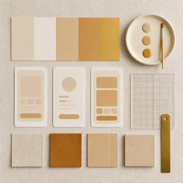
Pourquoi les palettes chaleureuses bousculent le minimalisme froid
Minimalist interfaces built on cold colors once dominated digital products. Designers now return to warmer digital color palettes to rebuild emotional connection and trust, using each hue as a narrative tool. This shift affects every color decision, from a website hero to an app onboarding screen, and from a simple gradient background to complex collage layouts.
Where a flat blue and black interface felt efficient, it often created distance and a dark emotional baseline for users. Warm palette color choices such as terracotta (#E07A5F), burnt orange (#CC5500), and muted coral (#F28C82) introduce softer contrast that still respects accessibility while signaling care and authenticity. These warmer color schemes help users explore content with less fatigue and more perceived closeness to the brand.
On a banking app, a bold color accent in warm amber (#FFB347) can guide attention more gently than a harsh neon, especially when paired with a subtle palette gradient behind cards and charts. E‑commerce websites now use layered color palettes with warm neutrals instead of pure black and white, creating a collage of textures that feels tactile and human. For junior designers, the key is to explore how each color palette supports the story of the product rather than chasing trends for their own style.
Warm palettes also change how users experience touch interactions on mobile. When people open a touch device interface built with warm gradients, swipe gestures and tap feedback feel less mechanical and more organic. This sensory layer matters because users explore content not only with their eyes but also through micro feedback from selected touch states, directional arrows, and smooth screen transitions.
For branding teams, this return to warmth is not a nostalgic move but a strategic one. A palette branding system that combines warm base colors with high‑contrast accents can differentiate a logo in crowded social media feeds without relying on aggressive saturation. The most effective warm digital color palettes balance emotional impact, accessibility contrast ratios, and long‑term flexibility across projects, platforms, and interface features.
Terreux versus néons vibrants : deux directions chromatiques complémentaires
In current warm digital color palettes, two chromatic families coexist rather than compete. Earthy colors such as clay, sand, and olive green speak to ecological aspirations, while neon gradients in magenta or electric cyan help capture attention on dense digital surfaces. The challenge is to build a coherent color palette that lets both families live together without visual noise.
Think of a sustainability‑focused website that uses a warm earthy palette color for backgrounds and typography. Strategic neon accents in buttons or micro interactions create a guiding gradient that leads the eye, while still keeping the overall style grounded and calm. This balance allows users to explore content smoothly, because the bold color moments are rare, intentional, and supported by sufficient contrast for readability.
On social media campaigns, brands often design multiple color schemes for the same message. A dark mode version might rely on deep charcoal (#121212) instead of pure black, combined with warm oranges to maintain legibility and emotional warmth. For light mode, designers can pick colors from the same gradient family but shift the values to keep contrast above the WCAG 4.5:1 threshold for text.
UX audits frequently reveal that color systems fail not because of hue choices but because of inconsistent application across app screens. A structured UX audit of color usage helps map where palettes drift, where contrast collapses, and where gradients overpower content. For junior designers, documenting every color palette decision in a shared system is as important as the initial inspiration phase.
On touch device interfaces, neon accents can highlight swipe gestures, selected touch states, and arrow‑based navigation without overwhelming the base palette. Device users benefit when palette branding rules specify how bright colors behave in hover, focus, and active states. When these rules are clear, teams can explore touch interactions confidently while keeping warm digital color palettes consistent and accessible.
Hybridation des matières : textures, collages et imperfections numériques
The rise of AI‑generated visuals has pushed designers to reclaim imperfection as a design asset. Warm digital color palettes now often combine rich colors with grain, noise, and collage‑like compositions to create richer sensory experiences. This hybridation of textures, gradients, and photography helps digital products feel less sterile and more crafted.
In a portfolio website, for example, a designer might layer a soft gradient in warm peach behind a scanned paper collage. The color palette then works with the texture to suggest depth and tactility, even on a flat screen. When users explore the work, subtle motion on hover or selected touch states reinforces the sense that each project is unique rather than generated from a template.
Branding systems increasingly integrate these tactile features into their palette branding guidelines. A logo might appear in a clean vector version for app icons, while marketing visuals use the same colors with added grain or rough edges. This approach keeps color schemes consistent while allowing style variations that signal humanity and craft.
Feedback loops are crucial when experimenting with such hybrid palettes. Structured sessions based on effective user feedback help teams understand how real users explore touch interactions, swipe gestures, and navigation arrows within textured environments. Designers can then adjust contrast, simplify gradients, or reduce black overlays where users struggle to read or navigate.
For junior designers, a practical exercise is to build a small collage‑based landing page using only one warm color palette and one dark accent. Test how device users respond to different palette gradient combinations, and log every change with a short note explaining the design decision. Over time, this practice builds a personal library of warm digital color palettes that are not only beautiful but also validated by real usage.
Psychologie des couleurs chaleureuses et perception de confiance
Color psychology is not magic, but patterns do emerge across studies and projects. Warm digital color palettes tend to increase perceived friendliness, approachability, and authenticity when applied with care. The same color palette can feel manipulative or sincere depending on contrast, context, and content.
In financial or healthcare apps, for instance, a palette built around warm neutrals and soft greens can reduce anxiety. Users explore forms and data visualizations more calmly when the interface avoids aggressive reds or overly dark backgrounds. However, designers must still ensure that error states use clear colors and sufficient contrast so that critical messages are unmistakable.
On social media platforms, brands that rely solely on cold blues risk blending into the feed. Introducing a bold color accent in warm coral or amber can make posts more recognizable without resorting to clickbait aesthetics. A consistent palette branding strategy across posts, stories, and website landing pages reinforces this recognition over time.
Emotional design also extends to micro interactions such as swipe gestures, selected touch highlights, and arrow‑based navigation. When these states use warmer colors instead of pure black or harsh neon, device users often report a softer, more respectful experience in usability tests. Designers can pick colors for these states that align with the main color schemes while still standing out enough to guide action.
For those building their first projects, a helpful resource is a detailed guide on choosing the right color palette for a digital product. Use such references to structure your own experiments with warm digital color palettes, documenting how different colors influence perceived trust. Over time, your intuition about which color palettes support which emotions will become a reliable design tool rather than a guess.
Passer d’une palette froide à une palette émotionnelle sans perdre la marque
Many teams want warmer interfaces but fear breaking existing branding. Transitioning to warm digital color palettes can be gradual, structured, and fully aligned with a brand’s core identity. The goal is to evolve the color palette, not to erase it.
Start by auditing every place where color appears, from the website header to app buttons and social media templates. Map which colors are essential to logo recognition and which are flexible accents that can shift toward warmer tones. This inventory also reveals where contrast is already weak, especially when black text sits on dark backgrounds or low‑saturation gradients.
Next, define a transitional palette color set that keeps one or two legacy hues while introducing new warm companions. For example, a brand built on cold blue can add warm sand and muted terracotta as supporting colors in cards, illustrations, and collage elements. Over several projects, these warmer colors can take more space while the original blue remains in the logo and key navigation.
On touch device interfaces, update micro interactions first, because users explore these details constantly. Adjust swipe gestures, selected touch highlights, and arrow indicators to use the new warm accents, then monitor how device users respond through analytics and qualitative feedback. Document every change in a design system, including rules for palette gradients, bold color accents, and dark‑mode adaptations.
Finally, align legal and communication layers with the new visual language. Even pages like the privacy policy can benefit from improved readability through better contrast and warmer backgrounds, without compromising seriousness. When every surface reflects coherent warm digital color palettes, users explore the product with a clearer sense of continuity, and key entry moments such as sign‑up or checkout feel more reassuring than purely transactional.
FAQ
How do I start building warm color palettes for a first digital project ?
Begin with one primary warm hue such as terracotta, then add a lighter tint for backgrounds and a darker shade for text or key accents. Complement this base with a neutral like warm gray to keep contrast under control. Test the color palette on both website and app mockups to ensure consistency across devices.
How can I keep accessibility while using warm gradients and textures ?
Check every text and icon against its background using a contrast checker, aiming for at least a 4.5:1 ratio. When a gradient reduces legibility, add a subtle overlay or adjust the palette gradient stops rather than abandoning the warm colors. Always test on a touch device to see how users explore content in real conditions.
What is the best way to transition an existing brand to warmer colors ?
Identify the core brand colors that must stay, usually those tied to the logo and long‑term recognition. Introduce warm supporting colors gradually in secondary elements, illustrations, and social media visuals before changing primary UI components. Document each step so that future projects follow the same palette branding rules.
How do warm palettes influence user trust in digital products ?
Warm colors often signal care, proximity, and human presence when used with restraint. In sensitive contexts such as finance or health, they can reduce perceived coldness without sacrificing clarity or seriousness. The key is to combine warm hues with clear hierarchy, strong contrast, and honest content so that style never hides information.
Which tools help designers pick colors and test them across interfaces ?
Designers commonly use tools like Figma, Adobe Illustrator, and dedicated color palette generators to pick colors and build color schemes. Browser‑based contrast checkers help validate accessibility, while prototype tools let users explore swipe gestures, selected touch states, and arrow‑based navigation. Combining these tools with real user feedback ensures that warm digital color palettes work beyond the static mockup.