Le piège du template dans le design graphique numérique
Most digital graphic design projects now start from a template. The same gradients, the same flat illustration style, the same centered composition quietly spread across the web. For a junior designer, it feels efficient but quickly erases any chance to build a distinct visual culture.
Look at recent product landing pages and you will see identical structures. The design often repeats the same layout grid, the same motion design micro interactions, the same rounded cards and soft shadows. These works are not bad, yet les interfaces become interchangeable and the brand point of view disappears behind generic elements.
The rise of Canva, Figma community files, and AI generated layouts has accelerated this standardization. A digital template can be duplicated in seconds, then slightly recolored, and shipped as a new project. When every designer and many developers rely on the same presets, the international visual landscape flattens and actualités in design graphique numérique start to look like a press release loop.
For students and people in reconversion, the risk is deeper. You learn to manipulate tools but not to question structure, hierarchy, or composition in a critical way. You become an operator of templates rather than an author of digital experiences, and your portfolio of works struggles to show what you uniquely bring to a collaboration.
Escaping this trap does not mean rejecting templates entirely. It means using them as a starting point for exploration, then deliberately breaking their grid, rhythm, and animation logic. The goal is to reintroduce intention into every design decision so that your design graphique numérique reflects a specific culture and not only the default settings of your software.
Revenir aux fondamentaux : grille, hiérarchie et espace blanc
When everything looks the same, fundamentals become your sharpest tool. A strong grid, a clear typographic hierarchy, and generous white space can transform even simple digital layouts into memorable interfaces. This is where design stops being decoration and becomes structure for meaning.
Start with the grid before touching color or illustration choices. Decide how many columns you need, how content flows between desktop and mobile, and where motion will guide the eye. By clarifying this invisible composition, you create a framework where each point of interaction and each animation supports the story instead of fighting it.
White space is not empty space, it is a design element that shapes perception. In design graphique numérique, spacing defines how users scan web pages, how they read press style headlines, and how they interpret visual hierarchy. Tight layouts often feel cheap, while controlled breathing room signals confidence and a mature culture of design.
Typography carries both information and attitude. Choosing a typeface family, setting consistent scales, and aligning text with your grid will do more for your identity than any trendy motion design effect. If you want a deeper dive into how color and type interact in digital branding, the article on the shift from poster to pixel in graphic design offers a useful historical perspective.
For juniors, a practical exercise is to rebuild a popular template from scratch. Strip away the original colors, icons, and illustrations, then redesign the structure using your own grid and typographic system. You will feel how much control you gain when composition decisions are yours, not inherited from anonymous works circulating on international marketplaces.
Couleur et tendances : choisir une palette qui sert le propos
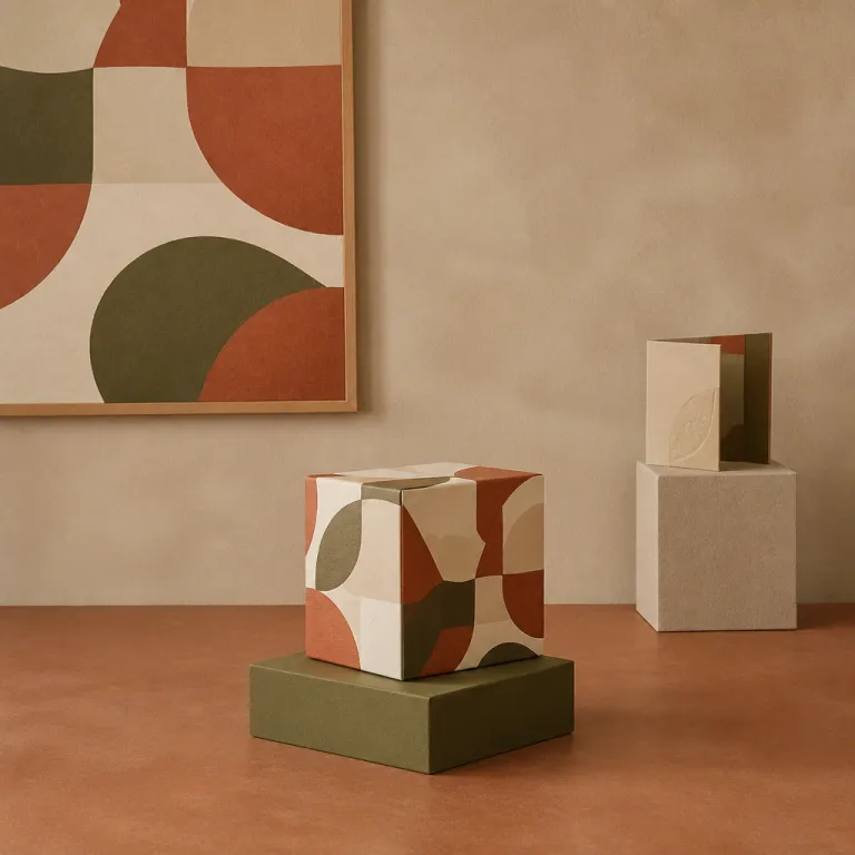
Color trends in digital design change faster than most brands can rebrand. One season, gradients in pastel tones dominate product pages and motion backgrounds, then darker palettes take over interfaces for creative tools. If you chase every trend, your design graphique numérique will age before your project even launches.
Recent palettes like Future Dusk, with deep blue violet tones, or Mocha Mousse, with earthy browns, show how mood can shift perception of the same layout. A red and black composition with small neon accents can feel bold and press like, while the same structure in muted tones feels editorial and calm. The key is to align color with the culture of your audience, the international context of your brand, and the emotional point you want to make.
In practice, start from content and not from the color wheel. Map the main user journeys, identify the critical interfaces where decisions happen, and assign color roles to support those moments. Primary actions, feedback states, and motion design cues should all be part of a coherent system rather than isolated elements dropped on top of a template.
For designers working on web products in the tech sector, this guide on choosing the right color palette for your IT business offers concrete frameworks. It helps you connect brand strategy, accessibility constraints, and digital environments where your works will live. Use such resources as starting points, then adapt them to your own structure and collaboration context.
Remember that animation amplifies color choices. A subtle motion on hover can make a quiet palette feel alive, while aggressive transitions can make even soft tones feel tiring. Treat color, motion, and composition as a single design system, not as separate layers added at the last minute.
Typographie comme identité : lettres, rythme et motion
Type is where many digital brands now differentiate themselves. While layouts and illustration styles converge, typographic choices still offer a wide field for experimentation in design graphique numérique. A single expressive typeface can shift the entire tone of your interfaces without changing the underlying structure.
We see more designers using typographic collages, variable fonts, and animated lettering to create motion driven identities. Letters stretch, compress, and react to scroll, turning simple headlines into micro narratives. This kind of motion design must remain legible, yet it can inject personality into otherwise standard web compositions.
For juniors, the temptation is to stack too many expressive fonts in one project. A better approach is to build a disciplined system with one or two families, then explore variation through weight, size, and animation. Think of each typographic element as part of a living interface, not as a static poster transplanted into a digital context.
Collaboration with developers becomes crucial when typography moves. Variable fonts require careful performance considerations, and complex animation demands clean code to avoid jank on lower power devices. A strong partnership between designer and front end developers turns ambitious typographic works into reliable user experiences instead of fragile experiments.
To ensure that your typographic decisions actually improve usability, a structured UX audit can help. Resources like the guide on enhancing user experience with UX audits show how to test hierarchy, readability, and interaction patterns. When you combine this analytical lens with a bold typographic culture, your design graphique numérique stands out without sacrificing clarity.
Workflow concret : du moodboard singulier au prototype animé
Escaping template thinking starts long before you open your design tool. The way you research references, build moodboards, and define constraints will shape every digital decision that follows. If your only inputs are Pinterest boards and popular Dribbble shots, your outputs will inevitably echo the same visual clichés.
Begin by widening your reference culture beyond the web. Look at print press layouts, exhibition signage, experimental illustration works, and motion pieces from film title designers. Capture structures, rhythms, and elements that resonate with your project, then translate them into interfaces rather than copying surface styles.
When you assemble a moodboard, limit the number of direct UI screenshots. Mix photography, typography samples, animation stills, and even architectural compositions to inspire your grid and hierarchy. This approach helps you think in terms of structure and composition instead of ready made components.
Once the moodboard feels coherent, move into low fidelity wireframes that focus on content and flow. Only then bring in color, type, and motion design details, always checking that each new element serves the original intent. This staged process may feel slower at first, yet it saves time by reducing late rework and misaligned collaboration with stakeholders.
Throughout the workflow, document your decisions. Note why a particular animation supports a key interaction, or how a specific composition reflects the brand culture. These notes become valuable when you present your works to clients, when you onboard new designers, and when developers need clarity on the rationale behind each interface.
Travailler avec l’IA et les templates sans perdre son identité
Generative AI tools now produce logos, layouts, and illustrations in seconds. For design graphique numérique, this changes the nature of the job but not its core responsibility. Your role as designer shifts from producing every pixel to curating, editing, and structuring visual decisions with intent.
Using AI to generate initial compositions or motion ideas can accelerate exploration. However, raw outputs often lack coherent hierarchy, accessible color contrast, or a consistent typographic system. Treat these digital sketches as rough material that you will refine through your knowledge of structure, interfaces, and user behavior.
Templates and AI models are trained on existing works, which means they reproduce dominant aesthetics. If you rely on them without critique, your projects will mirror the same international trends and erase local culture nuances. The value you bring lies in questioning these defaults and reintroducing context specific elements into the final design.
Set clear rules for when automation helps and when it harms. For example, you might use templates for internal documents or quick press visuals, while reserving fully custom design for flagship products and brand defining interfaces. This balance protects your identity while respecting time and budget constraints.
Ultimately, identity emerges from consistent decisions across touchpoints. Whether you start from a blank canvas, a template, or an AI suggestion, your responsibility is to align motion, composition, and content with the story you want to tell. That is how design graphique numérique remains a craft, not just a sequence of automated clicks.
Construire une carrière : montrer sa singularité dans un marché saturé
For students and career changers, the portfolio is often the first real product. Recruiters and creative directors scan dozens of digital portfolios that share the same templates, the same case study structure, and the same mockup devices. To stand out, you must show not only polished interfaces but also how you think about design.
Curate a small number of projects where you can explain structure, composition, and motion choices in depth. Show early sketches, failed attempts, and how collaboration with developers or content teams shaped the final works. This narrative reveals your process and your ability to move beyond surface level web aesthetics.
When you present projects, connect them to real constraints and measurable outcomes. Explain how a new interface reduced support tickets, how an animation clarified a complex interaction, or how a typographic system improved readability for an international audience. Concrete results demonstrate that your design graphique numérique is not only visually appealing but also strategically effective.
Engage with the broader culture of design through meetups, online communities, and critical writing. Comment on actualités in the field, analyze why certain trends dominate, and share your own experiments with motion design or unconventional compositions. Over time, this public thinking builds your reputation as a thoughtful designer rather than just another executor of templates.
Remember that identity is not a single heroic project but a pattern across many decisions. The way you choose tools, the references you collect, the collaborations you seek, and the risks you take in your interfaces all contribute to a recognizable voice. In a saturated market, that voice is your most valuable asset.
Key figures on digital graphic design and differentiation
- According to a Nielsen Norman Group study on web usability, users typically leave a page within 10 to 20 seconds if they do not find a clear value proposition, which underlines how strong visual hierarchy and distinct design are critical to retention.
- Data from the WebAIM Million report shows that over 96 % of the top one million homepages tested have detectable WCAG failures, indicating that many visually polished interfaces still neglect accessibility fundamentals in their design graphique numérique.
- A survey by InVision on product design collaboration reported that teams with a documented design system were 30 % more likely to release products faster, highlighting the impact of structured composition and shared elements on workflow efficiency.
- Research from Adobe on creative careers found that designers who regularly update and refine their portfolios are significantly more likely to receive international job offers, reinforcing the importance of showcasing unique works rather than template based projects.
FAQ about design graphique numérique and identity
How can a junior designer avoid having a portfolio that looks like everyone else’s ?
Focus on a few projects where you control the entire process, from research to final interfaces, instead of many quick template based mockups. Show your sketches, reasoning about structure and composition, and explain how your decisions respond to specific user or business constraints. This depth of thinking is what differentiates your design graphique numérique in a crowded field.
Are templates always bad for digital graphic design ?
Templates are not inherently bad, they become a problem when used without critique. They can speed up production for low risk assets like internal documents or simple press visuals. For brand defining works and key web interfaces, you should treat templates as starting points and then customize grid, typography, color, and motion to reflect a unique identity.
What skills matter most to stand out in motion design and interactive graphics ?
Beyond software mastery, the crucial skills are timing, hierarchy, and narrative clarity. You need to understand how animation guides attention, how it supports or harms usability, and how it fits into the overall structure of your interfaces. Combining these principles with a solid grasp of design fundamentals will make your motion design feel purposeful rather than decorative.
How do I balance trends with timeless principles in my projects ?
Use trends as a vocabulary, not as a rulebook. Start by defining grid, hierarchy, and content priorities, then selectively apply contemporary colors, illustration styles, or motion patterns that reinforce your message. This way, your design graphique numérique feels current without becoming dependent on short lived aesthetics.
What tools should beginners prioritize for learning digital graphic design ?
For interfaces and product work, tools like Figma or Sketch cover most needs, while After Effects or similar software helps you explore motion design. However, the most important investment is time spent studying real products, analyzing their structure, and practicing redesigns with clear constraints. Tools change quickly, but the underlying principles of composition and visual communication remain stable.